15+ alternatives to Adobe Creative Cloud

We’re all familiar with Adobe Creative Cloud (née Creative Suite). Popular favorites are Photoshop, Dreamweaver and Fireworks. They’re great tools that are extremely powerful, get the job done and help create the best product for designers and consumers.

However, Adobe’s switch to a subscription model has infuriated some users; many swearing off the software giant’s applications, and searching the web for alternatives.

Whether you object to Adobe’s market dominance, can’t afford a Creative Cloud subscription, or just think it’s healthy to use a range of software, there are alternatives to the CC behemoth. Small independent software houses and international mega-corps offer plenty of choice for non-Adobe web design. Below are some of the best to get you started.

Graphics and illustration

Sketch ($49.99)

Bohemian coding’s Sketch is being touted by many as a viable alternative to Fireworks. At $49.99 it’s an affordable alternative to high-end vector applications like Illustrator.

sketch

Stencyl (from $79 per year)

Stencyl is a game creation platform that claims to create an easier workflow for you while rendering beautiful results. The best part of Stencyl is it exports using Flash or HTML5, depending on your preference. This is a great alternative to Adobe Flash and a great way to use HTML5 to create games and apps for interactive designs.

stencyl-copy

Pixelmator 2.1 ($14.99)

It’s tough to find a formidable bitmap application to rival Adobe’s Photoshop. We all use it and use all it’s features heavily. Pixelmator is a decent program that does pretty much everything Photoshop does. Of major importance is the fact that Pixelmator is built primarily for Mac OS so it links well to other Mac programs. Pixelmator is currently available in the Mac App Store for $14.99.

Pixelmator-copy

Gimp ($Donation)

It’s almost impossible to talk about design programs without mentioning Gimp as a close second to Photoshop. This open source solution is used for photo and image retouching, composition and authoring. Gimp also has the ability to create animated GIFs and MPEG files that can be used online.

gimp

Inkscape ($Donation)

Inkscape is an open source vector images editor that’s very similar to programs like Adobe Illustrator and CorelDraw. You can create almost anything in such a program whether it’s a logo or website design. Inkspace is also relevant to those of us who want to create and support SVG capabilities; Inkscape supports this file format which makes it easier to use online.

inkscape

Acorn 4 ($49.99)

Acorn is seen strictly as an image editor because it’s so simple. Sure, you can create more complex things like website designs and such, but Acorn is really great for enhancing your images. It’s quick and easy and many of the effects are editable and non-destructible. This is definitely great for the developer who doesn’t want to design a full website, but wants to make sure their images are correctly edited first.

Acorn-4-a-great-Mac-OS-X-image-editor-built-for-humans.-copy

Coding and development

Sublime Text ($70)

If you’re not into WYSIWG (What You See Is What You Get) HTML editors, then this is probably the text editor for you. It’s extremely sophisticated, easy to use and it just makes sense. It has excellent predictive code to help you create clean files. It also formats your code cleanly (if you let it). There are so many great features Sublime has to offer to make coding understandable and easy whether you’re a beginner or pro.

Sublime-Text-copy

Microsoft Silverlight ($Free)

Silverlight can fit just as well into a graphics application, but for the purposes of this article, we’ll make it about development. Silverlight is a framework that’s dedicated to helping create rich Internet applications. It’s considered the necessary framework for creating Windows Phone applications, but the support for Silverlight hasn’t gone widespread, and with the collapse of the Flash market and the rise of jQuery animation, it’s questionable how long it will be around.

Microsoft-Silverlight-copy

BlueGriffon ($Free)

BlueGriffon is a WYISWYG editor that’s based on the rendering engine of Firefox. They claim their interface is extremely easy to use for beginners and advanced developers as well. BlueGriffon is great for those of us who want to create web sites that still maintain the necessary web standards. It’s not the most beautiful application, but it gets the job done.

BlueGriffon-copy

Free HTML Editor ($Free)

First and foremost, this application is only for those of you using Windows. This HTML editor is a slimmed down version of the popular CoffeeCup Editor, but it still maintains some of the features used such as Code Cleaner which makes sure your code is squeaky clean. It’s a WYISWG editor that focuses on making development easy for all skill levels. This is a great tool if you’re looking for something and are a Windows user, there’s also a more advanced version at $69 should you wish to upgrade.

Free-HTML-Editor-copy

CoffeeCup Web Editor ($69)

This is the Free HTML Editor’s big brother, this time developed for MacOS. This powerful application allows you to make whole sites and get started in seconds. If you’re familiar with Dreamweaver, a lot of what you can do with that is available here in this Web Editor. You can link your files, upload via FTP and so much more with this tool. This Web Editor is available for only $69 which is honestly a steal for the features and value.

Web-Editor-copy

KompoZer ($Donation)

There are two groups of people who should be using KompoZer: the person who knows everything about coding or the person who knows nothing about coding. There’s no in between. KompoZer is extremely basic and isn’t as caught up in the fanciness as a CoffeeCup Web Editor may be. However, it’s still great for the pro who wants to check his work or the beginner who wants to fool around to see if they can make something.

kompozer

Other tools

Flow ($4.99)

As you can see, Flow claims to be the Mac’s best FTP + SFTP Client. Right off the bat, I’d have to agree. FTP’s (as you’ll see as you scroll down further) aren’t the most intuitive things in the world. You typically just find a way to upload your files and kind of go your ways. Flow has so many features that just make sense, like the ability to copy URLS, drag and drop files easily and preview images and files as you go along. Flow is available in the Mac App Store for $4.99 I recommend you all get it if you’re fed up with your old FTP client.

Flow-copy

Transmit ($34)

One of the most relied on FTP clients on the Mac, if you’re looking to replace that upload feature in Dreamweaver you should definitely check out Transmit. The Disk feature, allowing you to launch any of your saved favorites directly in the finder is awesome.

transmit

Cyberduck ($Donation)

This open-source FTP client is a little different because it’s been developed to work with your favorite cloud service. The interface is a bit easier to use than most standard FTPs, but it’s nothing that’s extremely out of the ordinary. Cyberduck gets the job done while working with your cloud storage for Mac and Windows.
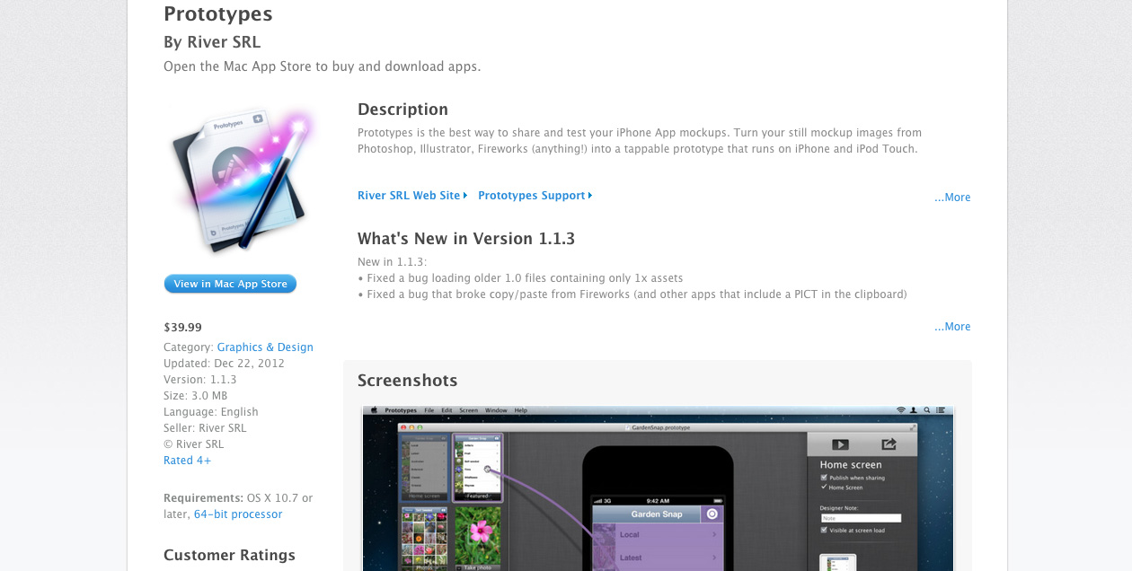
Cyberduck-copy

Prototypes ($39.99)

Earlier we talked about some platforms that make it easier to make rich applications. Prototypes is a simple tool that I think most designers, as well as app developers will want to work with. It shares and tests iPhone apps as you still design them. You can take your stand alone images from Photoshop, Illustrator or wherever and use Prototypes to make your application interactive. While it’s not exclusively web design, it’s definitely useful in making sure things work well for iPhone users.

Prototypes-copy

There’s something in this list for everyone interested in creating websites. You may have to pull a little trial and error to figure out what’s best for you and what works for your skill set. Web design and development is a very challenging task, but with the right tools and applications, anyone can create stellar sites in no time.

Will you be taking out a Creative Cloud subscription or hunting for alternatives? Have we missed any of your favorites? Let us know in the comments.

About the author
560ece2f63e56f55be024fc7e517bad7
Kendra Gaines is a freelance designer from Virginia, USA. Connect with her. More articles by Kendra Gaines


Big brand theory: packaging design

For most brands, recognition is everything. Occasionally you’ll encounter a company that seeks to create a air of exclusivity by shunning popular appeal, but for the large part companies need you to spot them immediately.

Brand recognition isn’t about making a good first impression, it’s about up-selling; creating a way, once trust and even pleasure has been established by an initial sale (or in some cases just an advert), for the consumer to make a repeat purchase.

Brand recognition is even more important to companies that rely on impulse buys. Think of the last time you bought a soda in a shop, did you consider your mood, compare the advertised flavors, check calorie content and make an informed decision? Probably not, more likely you just grabbed the can that bore the same brand as the can you bought the time before.

9 times out of 10, when I walk into a shop for a soda, I come out sipping Dr Pepper. I know I like lots of other brands, but I always pick up Dr Pepper.

Malaysian designer Ewan Yap has tried to test the boundaries of brand recognition by cropping the branding of 16 soda and beer cans. Some are still easily recognizable — who could ever miss Coca-Cola’s iconic script? Others are harder to spot.

What results are a series of package designs that reference, but don’t directly tally with the original brand. The Pepsi and Guinness cans may simply look like limited edition packages but others, particularly the Carlsberg and Heineken cans, bear the most tentative resemblance.

Yap asks “But do these brands have the guts to leave things out?”. The clearly modern, contemporary feel of the designs would make them excellent candidates for a new brand, but whilst it’s an interesting exercise in reductionism, for the most part Yap’s redesigns break the brand recognition that that has been carefully cultivated by these companies for decades. As such, they’re unlikely to be adopted.

It just goes to show, when designing a brand, be careful what you leave in; you may be stuck with it.

7up

a_w

carlsberg

coke

dr_pepper

fanta

Gatorade

guinness

heineken

mtn_dew

pepsi

pocari_sweat

red_bull

sprite

tiger

zero

What do you think of this reduced branding? Which brands do you still recognize?

About the author
7ef79c4543148d4ff5c75498db18857d
Benjie Moss is editor at WebdesignerDepot. He likes type design, semantic markup & elegant code. He’s usually training for a marathon. You can follow him @BenjieMoss. More articles by Ben Moss

Outstanding illustrators from all over the world

Jika berbicara tentang seorang ilustrator yang ada dibenak kita selalu orang-orang yang mengekspresikan diri mereka ataupun lingkungan dalam bentuk gambar. Karakter unik dan pemikiran yang khas sering kali membuat penikmatnya terkagum-kagum. Karya-karya beberapa ilustrator yang akan saya bahas kali ini adalah beberapa illustrator yang menurut saya memiliki karya yang unik dan menyegarkan untuk saya pribadi. Seperti apa karya dan profil dari pembuatnya sendiri ? check this out~

Yaeko Abe

image.aspx

11

10


9

8

7

6

5

4

3

2


“I am a professional and an experienced illustrator”

ImageScaler.aspx

Graduated from Fashion Institute of Technology located in New York City with a Bachelor’s degree in Fashion Illustration and Toy Design. She originally started career as a toy designer, working with widely recognized brands and companies like Barbie, Nickelodeon, and Disney.

She work mainly by hand, but also combine traditional techniques with digital media, allowing to be flexible with the needs of clients.

12

Client List

  • Hasbro
  • New Look
  • ELLE Russia
  • ELLEgirl Japan
  • MEGA Brands
  • NY Cake
  • Jakks Pacific
  • Techno Source USA

Check her profile and portfolio at http://www.illustrationweb.com/artists/YaekoAbe/profile

Katharine Asher

a

b

c

d

e

f

g h

i

j

k

l

m

n

“I have worked as a freelance within illustration and design for many years, specialising in figurative work. My early formal training at Harrow College of Art focused on strong traditional drawing skills, the ability to think in three dimensions and a thorough understanding of anatomy and movement. This has proved to be the backbone of my skill base, enabling me to attract work from a wide variety of commercial sources from publishing and advertising to film”

p

“I continually evolve my style which keeps my focus fresh and my work in line with commercial trends”

s

Client List

  • Max Factor
  • Elizabeth Arden
  • BBC
  • McClelland Whisky
  • Pulse Films
  • Mail on Sunday
  • JWT
  • Armani

Check her profile and portfolio at http://www.illustrationweb.com/artists/KatharineAsher/profile

Greg Becker

aa

bb

bdhtrhrh

dd

fbdbdrb


fbfcbfcb

fbrfb

fcbfbfb

ff

gngtfn

hh

nftgnfnf

nnbn

xx

yy

“Since leaving the Royal College of Art I have worked as an illustrator for many leading newspapers, magazines and publishing houses”

“I see my work as a mixture of humour, mood and symbolism blended together to try and create my own idiosyncratic world, using coloured pencils, inks,watercolours and acrylic paints”

dththdth

btbrbtrhbrf

Client List

  • Dorling Kindersley
  • Puffin Books
  • Heinemann
  • Hewlett Packard
  • BBC Publications
  • The Guardian
  • The Times
  • New Scientist
  • Random House
  • Hay house publishing
  • Michael O’mara
  • Cowley Robinson
  • Quarto Books
  • Scholastic

Check profile and portfolio at  http://www.illustrationweb.com/artists/GregBecker/profile

Bompas and Parr

fdbdbtbfb

fdbzdbdfbf

fngnfgbc

sdgsdgsd

sdvvsdv

svdvsvsdv

Bompas & Parr designs spectacular food installations often working on an architectural scale with cutting edge technology.

Bompas & Parr has worked with architects including Lord Foster and Rogers Stirk Harbour + Partners designing jellies for a 2000 person Jelly Banquet at UCL and worked with the ICA to transform Peter Greenawayï  The Cook The Thief His Wife and Her Lover for a scratch sniff event.

sdvsdvsd

vdsvdv

Recent projects include an eight course Black Banquet for the London Design Festival, a vast glowing jelly installation for SFMOMA and Alcoholic Architecture, a walk in cloud of breathable G&T. For the Alcoholic Architecture installation Bompas & Parr worked with three different doctors to calibrate the potency of the cloud.

Client List

  • Courvoisier
  • Disney
  • Hendrick’s
  • Kraft Foods
  • Selfridges
  • School of Life
  • SFMOMA
  • Victoria & Albert Museum

Check profile and portfolio at  http://www.illustrationweb.com/artists/BompasandParr/profile

BoomArtwork

axascsaca

bdfbdfbd

csdggdsg

cwscewcewff

dcscsdcsdv

dfbdfbdf

dfbdxbdbrx

ergrges

fgxfgnf

hhuulijolui

i;jij;;oi;

sacacc

vbgrbabt

xbdfbdbx

xbdfbdfbxb

Award wining illustrator Eric Van Den Boom a.k.a. BoomArtwork is specialising in illustration and custom lettering since 2005. He works from his studio based in Utrecht, the Netherlands.

His illustrations are often described as strong and detailed, vintage with a contemporary touch, authentic and elegant with an edge.

scsacascA

scascasca

He is producing a wide range of illustrative design work for advertising, cultural markets, fashion, lifestyle, editorial and music industry and has worked with clients ranging from small non-profit organisations to major advertising agencies all over the globe.

Client List

  • Ray Ban
  • MTV Networks
  • Subway Restaurants
  • Amsterdam Central Station
  • Las Vegas Weekly
  • Fair Wear Foundation
  • Computer Arts
  • KPM Music House

Check profile and portfolio at  http://www.illustrationweb.com/artists/BoomArtwork/profile

Kat Cameron

dfbsdvsd

dsvsdv

dvdsv

dvdsvdsv

ehseet

htehehhe

hteherhe

rthehet

sdvsevav

sdvsvs

svasas

svdvdsvs

svsdvsd

trhrh

trhtrhtr

Kat Cameron is an illustrator, product and textile designer living on the sunny Gold Coast in Australia.

She gathers her inspiration from her love of life, cuteness, fun, japanese inspired, vintage homewares, retro designs, babushka dolls, bold colours, kids toys, childrens books, the dark side, bunnys and kittens.

fbdbd

rhrdfd

Kats images are created through drawings and then re-created and refined using Adobe Photoshop and Illustrator.

Client List

  • Coke
  • McDonalds
  • Orange Mobile
  • Cadbury
  • Mambo
  • Daihatsu
  • Emirates Airlines
  • FHM Magazine
  • YEN Magazine
  • Shell
  • Stockholm Agency
  • Illicit Clothing
  • Dept of Physics (uk)
  • Total Girl Mag
  • Heresy Snowboards
  • RAC
  • Kustom Shoes
  • Beserk Clothing

Check profile and portfolio at  http://www.illustrationweb.com/artists/katcameron/profile

Petra Dufkova

dfsfs

dsfdfs

fasfdasdas

gdfgdr

gfwfgdwf

gsdgsd

hfdhfd

hgdrgdgdf

hrthrhthr

jjhkj

ljlilj

rdgrge

rgergerg

rgreggg

rgsgswe

rhthrh


sdgsdgs

sfsefsd

thdh

wefwefew

Petra has been educated in graphic design, painting and fashion design. She unites all of these areas in her work with a concentration on fashion illustration.

With loose and free marks but also the very precise line of her paintbrush and a dash of dirt, she manages to put her own dimension of lightness and presence into her work no matter how technical the theme, always injecting emotion along the way.

rgdgrd

vsdvs

Client List

  • Sunday Times
  • Ministry of Sound
  • Harlequin Enterprises
  • Shortlist
  • Antidote
  • Coca Cola
  • Tchibo
  • Speedo
  • Sony
  • Volkswagen
  • Cosmopolitan
  • Vanity Fair

Check profile and portfolio at  http://www.illustrationweb.com/artists/PetraDufkova/profile

Gordei

ascsaa

ascsas

cascac

cascas

cscas

cscsac

dscsc

dsvdsv

dvaav

sdvavd

svsav

svsdvs

vsavas

Gordei is a line with color illustrator, specialized in color illustrations. I didn’t get Gordei full profile but i like him illustration so i don’t want to miss the opportunity to share with you guys. 😀

Check profile and portfolio at http://www.illustrationweb.com/artists/Gordei/profile

Saya berharap kalian menyukai review my inspiration of illustration kali ini~ Mohon maaf jika bahasa inggris saya masih sangat berantakan.. haha.. See youu next review~ 😀


SAI (software)

SAI or Easy Paint Tool SAI (ペイントツールSAI?) is a lightweight raster graphics editor and painting software for Microsoft Windows developed and published by SYSTEMAX Software. Development of the software began on August 2, 2004, and the first alpha version was released on October 13, 2006. SAI’s official release (1.0.0) was on February 25, 2008, and an update preview was released shortly after. The software’s final revision, 1.1.0 was released in 2008. SYSTEMAX has not published any new information or updates since, and 1.1.0 is considered to be the final release.

Paint_Tool_SAI_Interface

Features

SAI is a lightweight painting application. The user interface allows multiple documents to be opened at the same time. The drawing canvas can be both zoomed and rotated using the sliders on the navigator or the hotkeys configured on the keyboard. The toolbar on the top part of the screen also includes a button to mirror the drawing view without mirroring the actual drawing. It is also possible to open multiple viewports to the same document. An application-wide scratchpad (which can be used as a color mixing panel) is provided, which is saved between sessions. Colors can be stored in the swatches panel.

Various raster drawing tools are implemented, such as the Airbrush, Watercolor, Pen, and Marker, which can all be easily customized, and stored in slots in the user interface of the application. There is also a set of vector drawing tools intended for inking, which, like the raster tools, can be configured to be pen pressure sensitive.

Work can be done on separate layers, which can be grouped and have opacity masks. In addition to this, layers can be masked by clipping them to a lower layer. This allows one to add shading and highlights to an area without creating new masks for the additional layers.

There is also a pen movement and pressure smoothing feature which can be manually configured as to how much effect it has.

Selection tools include the simple square selection, the lasso, and magic wand, which can be configured for anti-aliasing. There is also a selection brush tool, which can be customized like the drawing brush.

crescent_01

SAI comes with a full set of transformation tools that can work on selections, including move, resize, rotate, and a free (perspective) transform. Any series of transforms can be set up and then applied at once to a specific selection minimizing the softening of the image. There are two caveats with using the transform tools that often confuse new users and are not made clear by SAI’s sparse included English documentation.

First, SAI includes several tools for creating a selection, but only the rectangular (rubber band) selection tool shows the transformation options. But it does not matter how a selection is initially created, selecting the rectangular selection tool will then show the transformation options which will work fine with it. Effectively the ‘rectangular selection’ tool button (a dotted rectangle in the tool palette) is also the ‘make transform tools visible’ tool button.

Second, to apply the transform tools to a selection on a vector layer requires a non-obvious additional step. After creating a raster selection by whatever means, the user must click selection on the menu bar and then click either select points or select strokes from the drop down menu after which the selected points are highlighted and are affected by the transformation tools as expected. Those points remain selected until the menu is opened again and clear selected points is clicked, even if another raster selection is made. Many fairly experienced users assume that the transform tools do not work at all on vector layers. This has been erroneously repeated in some review articles and user provided tutorials around the web, including this Wikipedia article at one point.

Some common features that exist in similar software, such as text layers, gradients, and shape tools, are not implemented, as SAI focuses on drawing and painting, while the final composition is often done using another application. SAI displays white and transparency in the same way, which may cause significant display differences when exporting to another program, such as Adobe Photoshop. There is also no printing functionality, but documents can be exported in a range of popular formats, such as .PSD or .BMP files, in addition to the native .SAI format.

Because the program does not focus on image editing, the only adjustments present are Brightness/Contrast and Hue/Saturation, and therefore no support of level editing, channel extraction, etc. Users may use another program for more complex editing, but when the image is brought back to SAI, its properties may be changed.

SAI also includes linework layers, which can be used instead of manually drawing linework. The linework layer include different tools designed specifically for creating lineart, such as the Line, Curve, Pressure, and Weight tool.

Paint_Tool_SAI_XD_by_Ki14

Download and Purchase

The program is available in the form of a 31 day free trial, during which the users have full access to the program’s features. After this time period expires, a software license must b e purchased in order to continue using all of the program’s features, as it automatically disables the use of the “Open” and “Save” features after the trial’s expiration.

If you love the illustration and would like to describe it via digital, you can use this software because it is easy enough for the novice than the manual tracing through Adobe Illustrator. Good Luck~ 😀

You can download this software here : http://www.afterdawn.com/software/desktop/image_editing/painttool_sai.cfm

Free download: 25 Colorful Grunge Textures

This set of 25 Colorful Grunge Textures was designed by Florin Gorgan and is perfect for use as overlay textures on your photos. You can see more of Florin’s work in his site or his Etsy shop.

For best results, set the texture layer to Soft Light, Overlay, Multiply or Screen, depending on the look you want to get. You might also want mask some parts of the texture where you don’t want it to take effect. You can also use these textures as backgrounds for your design work, or to add a unique texture to your design or typography.

The pack contains 25 .jpg textures at 5000 by 5000px saved at 300ppi. The textures are compatible with all photo editors that support layers (Photoshop, Photoshop Elements, GIMP, Pixelmator etc.), both PC and Mac.

These textures are for both personal and commercial use. See the full preview after the jump… Enjoy!

preview

For Download check this website :  http://www.webdesignerdepot.com/2013/06/free-download-25-colorful-grunge-textures/

Sources : http://www.webdesignerdepot.com/

The trick to designing a great layout

Why are magazines and books always laid out the same? Even with alternative design, there is a harmony in layout or the reader’s head will explode… or they will just stop reading and skip to the next page. Successful design in publishing, advertising, web design, illustration and anything else that ties together elements depends on drawing in the reader, and leading their eyes across the page.

Some people think it’s not a big deal and that designing a page comes naturally because of cultural lessons we learn growing up and looking at design from childhood, yet few, if any, understand why it works the way it does. In most societies, we read left to right. Still sound simple? Just start on the left, and it will all fall into place? Basically, but the challenge is to make the reader look at elements in the right order, or at least the order you want them to see, which is the challenging trick in layout design.

Check this article —-> https://jasminepicha.wordpress.com/design/the-trick-to-designing-a-great-layout/

Revealing the secret history of four world famous fonts

Times New Roman

timesnewroman-ED_opt_system_default

The standard for essays, Times New Roman is possibly the world’s best-known font. Impersonal and unassuming yet clear and consistent, Times has the dubious honour of having been designed on a dare. The story goes that in the late 1920s, the advertising manager of London newspaper the Times approached Stanley Morison, a typographic consultant for the Monotype Corporation. Looking to sell some ad space, the Times offered to have the ad typeset by the paper’s compositors. Morison, deeply insulted, shot back that he would sooner pay them not to typeset the ad, going on to comment on the sad state of the Times’ typography in a very public article, essentially accusing the paper of being a typographic dinosaur.

Morison’s story made its way to upper management, and the Times eventually dared Morison to produce a better font. And that he did. By 1932 the Times had officially retired their old font, Times Old Roman, and introduced Times New Roman as the new standard for the newspaper. Designed specifically for readability on newsprint, Times New Roman had no sharp angles or thick sections, ensuring that ink wouldn’t get “trapped” during printing, effectively preventing smudging. It was also neutral and businesslike: Morison once mentioned it had “the merit of not looking as if it had been designed by somebody in particular.”

Times New Roman continued to be the standard for the Times for almost forty years, and enjoyed lasting popularity until Microsoft ultimately bundled it with Windows 3.1 in 1992. Every version of Windows since then has carried Times New Roman as one of the defaults for word processors, solidifying its status as one of the world’s most famous fonts.

Garamond

garamond2-ED_opt_system_default

Garamond has the distinction of being one of the great-grandfathers of modern typefaces, shaping the way fonts have developed for centuries. Designed by the Parisian publisher Claude Garamond over four-and-a-half centuries ago, Garamond is still widely regarded as one of the most legible typefaces ever designed, a true testament to its creator’s prowess. It enjoys success even today; you might recognize it as the font used by Apple in the 1990s, or the font used to set Dr. Seuss books. It is amusing to note that for almost a full century, what designers thought was Garamond turned out to be a completely different font.

In 1825, over two-and-a-half centuries after Garamond’s designs first began to circulate around Europe, the National Printing Office of France made an exciting announcement: they had discovered a previously unknown set of designs by Garamond. Over the next century, fonts and the art of typography saw a strong revival, and with it came new versions of Garamond, many based on the National Printing Office’s unearthed designs. The twist didn’t come until almost a century later, when type enthusiast Paul Beaujon happened upon the designs of a relatively unknown French printer named Jean Jannon at the American Type Founders’ library. Beaujon came to realize that the Garamond the National Printing Office had discovered over a century ago wasn’t a Garamond at all: it was a somewhat similar, yet completely unrelated font designed by Jannon. With this discovery came the realization that most of the Garamond revivals of the late nineteenth century were based upon a completely different font, designed by a completely different Frenchman. In 1927, Beaujon published his research in the Fleuron, a scholarly publication on type, and took a job soon afterwards at Stanley Morison’s Monotype.

Today, this is the stuff of typographic legend, but the story doesn’t end there. Beaujon wasn’t a man with a “long grey beard, four grandchildren, a great interest in antique furniture, and a rather vague address in Montparnasse,” as he had been described by his peers. In fact, he wasn’t a man at all. Paul Beaujon was the pen-name of one Beatrice Warde, who would go on to become the “First Lady of Typography,” the first woman to penetrate the otherwise male-dominated profession.

Helvetica (and Arial)

Screen_shot_2011-01-31_at_4.41.55_PM_original

Helvetica has always been considered a typographic giant. Designed by type salesman Max Miedinger in the 1950s (in his spare time, and at the behest of his boss), “The Swiss” — the English translation of the Latin word “helvetica” — was a response to Akzidenz Grotesk, an advertising font from the 1890s that still dominated the industry. Helvetica borrowed the sleekness of Akzidenz (and in fact the two looked deceptively similar) yet managed to be far more neutral, allowing for great versatility. As typographer Simon Loxley once put it, “Helvetica has been called the typeface with no distinguishing features. It can go anywhere, do anything; it’s everything — and nothing.”

The results of Helvetica’s legendary flexibility are a who’s who of brand giants: American Apparel, Fendi, Jeep, American Airlines, GM, Nestlé — the list goes on. It’s no surprise then, that “when in doubt, Helvetica” has become a maxim for designers the world over. Helvetica is also polarizing, with designers being grouped into two categories: those who love it, and those who hate it.

As much as some designers might hate Helvetica, it’s nothing compared to how most feel about its bizarro brother, Arial. Deemed a bastardization of a theoretically “perfect” typeface, Arial was commissioned by Microsoft for use in Windows 3.1. The result was a font nearly identical to Helvetica (in fact, both fonts look so alike that most people will never notice the difference), but without the accompanying royalties. Over the next two decades, Arial went on to become the world-famous font that it is today, while Helvetica remains significantly less popular. A great irony, considering that Microsoft’s own logo is set in Helvetica.

Comic Sans

Screen_shot_2011-01-31_at_4.40.51_PM_original

The font everyone loves to hate, Comic Sans is a designer’s worst nightmare: its childish, unsophisticated letterforms and uneven letterspacing have made it the butt of jokes for years. As (in)famous as Comic Sans might be today, its beginnings were nothing if not modest. Designed by Microsoft employee Vincent Connare, Comic Sans was originally intended as a companion to the “Microsoft Bob” application — Windows 95’s “helper program,” and Clippy’s (the Microsoft Word animated paperclip) predecessor. Using the lettering in graphic novels such as Watchmen and The Dark Knight Returns as reference, Comic Sans was designed in little over a week. Eventually, a product manager for Windows 95 took a liking to the font and chose to include it as a standard on Windows’ operating system.

Though it enjoys relative success even today, being featured on T-shirts, restaurant menus, and advertisements, Comic Sans’ goofiness has earned it disdain. “Ban Comic Sans,” a movement to eliminate the use of the font, has used stickers to educate about the inappropriateness of Comic Sans’ use in everyday life. And how about the font’s Dr. Frankenstein, Vincent Connare? He’s definitely aware of his creation: “If you love it, you don’t know much about typography.”

Sources : http://thevarsity.ca/2011/01/31/revealing-the-secret-history-of-four-world-famous-fonts/

Epic land art

While most artists seek to have their work immortalized, 51-year-old Jim Denevan plans for his art to be temporary. His enormous land creations use natural materials like sand, earth and ice, effectually making the landscape itself become the means of his masterpieces. Due to their colossal scope, aerial photography is often employed to appreciate the full piece, while at the same time preserving the art before the tide or other natural elements wipes away his work.

Using rakes, sticks and other instruments, the California-based artist traces intricate, geometric patterns. Sometimes he works alone, and other times has made use of a large crew. When The Anthropologist commissioned a project on Lake Baikal in Siberia using ice and snow, the team successfully produced the largest work of art in the world.

Although Denevan considers the erasure of his work by weather and waves to be simply part of the process, its beauty is preserved on film for us to appreciate. Here’s a closer look at his awe-inspiring epic art.

jd001

jd002

jd003

jd004

jd005

jd006

jd007

jd008

jd009

jd010

jd011

jd012

jd013

jd014

jd015

jd016

jd017

jd018

What aspect of Denevan’s creations do you find most impressive? Should Denevan’s creations be preserved or allowed to disappear? Let us know your opinion in the comments.

About the author
Stacey Kole is a freelance writer and former magazine editor. When she’s not crafting copy or chasing after her two little boys, Stacey can be found drinking coffee, tea, or anything else with caffeine. You can connect with her on LinkedIn. More articles by Stacey Kole

Amazing Gift !

Holla minna~ Today i will show you about many talented illustrator.. For me, they are some of the illustrators who have special talents.. Special gift from God..

I hope all of you have the same opinion with me~ Enjoy~

Esra Røise

esra-roise-001

esra-roise-002

esra-roise-003

esra-roise-004

esra-roise-005

Esra Røise is a Norwegian illustrator based in Oslo. She is inspired by everyday situations and snapshot photography due to their impulsive nature and bad cropping. You can see this in her work, which are often simply pencils and flashes of colour. They come alive, despite the fact that illustration is inanimate. Her facial expressions are unusual and intriguing and boy, can she draw hair! Clients include Vogue, Wallpaper*, United Airlines and Nike.

Olga Stern

olga-stern-03

olga-stern-01

olga-stern-04

olga-stern-05

olga-stern-02

Olga Stern is a Toronto-based illustrator and visual-development artist. Her portfolio is a wash of cheerful characters and mediums. Although, it is pretty clear to see her biggest strength is her sweeping background designs. They are exquisitely textured, the colours are vibrant but harmonious, and they are in every sense of the word picturesque. Stern’s previous clients include Pixar, Laika, ACME filmworks, and Head Gear Animation. You can find more of her work by heading to her website.

Daryl Mandryk

daryl-mandryk-01

daryl-mandryk-05

daryl-mandryk-02

daryl-mandryk-04

daryl-mandryk-03

Ridiculously skilled work from freelance artist Daryl Mandryk. Based in Vancouver, Canada he has worked on games, film, print, and the web. Recently working as Lead Concept Artist on video games Tron Evolution and Turok, his previous clients include EA, Lucasfilm, Hasbro, Dark Horse Comics, and Imagine FX Magazine. Filled with emotion and movement, his work manages to convey each scene in the height of the action. To see more of Mr. Mandryk’s work, head over to his website.

Ed J Brown

ed-j-brown-001

ed-j-brown-002

ed-j-brown-003

Mancunian Ed J Brown is an illustrator with some fantastic hand-drawn type skills. His humour comes through in his work, which is pumped with bold colours and jagged lines. Pretty exciting stuff. “All his work consists of completely hand drawn and hand made images, even the colours he uses come from scanned in sugar paper – this is all assembled in Photoshop like a big sexy jigsaw.”

Keunju Kim

keunju-kim-01

keunju-kim-02

keunju-kim-03

keunju-kim-04

keunju-kim-05

Keunju Kim aka Rabbiteyes is based in Seoul, South Korea working as a Concept Artist and Art Director. Having previously worked for games company gumi Inc., as of May, Mr. Kim became freelance. He definitely one of those illustrators whose ability appears limitless. His backgrounds are just as strong as his character design, his pencils are just as sumptuous as his painting. No matter how fantastical his character are, they always seem to have a realism. I haven’t quite put my finger on why that is, but one reason has to do with his emphasis on the eyes. To find out more about Keunju Kim check out his website and deviantArt page.

Sources : http://illustratorslounge.com/

Manga Thursday ~ Inio Asano

inio-asano-001

inio-asano-002

inio-asano-003

inio-asano-005

inio-asano-004

Inio Asano is probably best known for her highly acclaimed manga ‘Solanin’, which was turned into a feature film starring actress Aoi Miyazaki in 2010. Asano’s work ranges from realism to psycho-horror, and is very character driven. Of course we are all about illustration here on The Lounge, but I guess I can’t write about Asano without mentioning she is transgender, as it is such an interesting fact about the artist herself. You can visit her page on Anime News Network to find out a little more.

Sources : http://illustratorslounge.com/